Friday 24 January 2014

Module 1. Chapter 2: Coloured Paper

Making Coloured Paper.

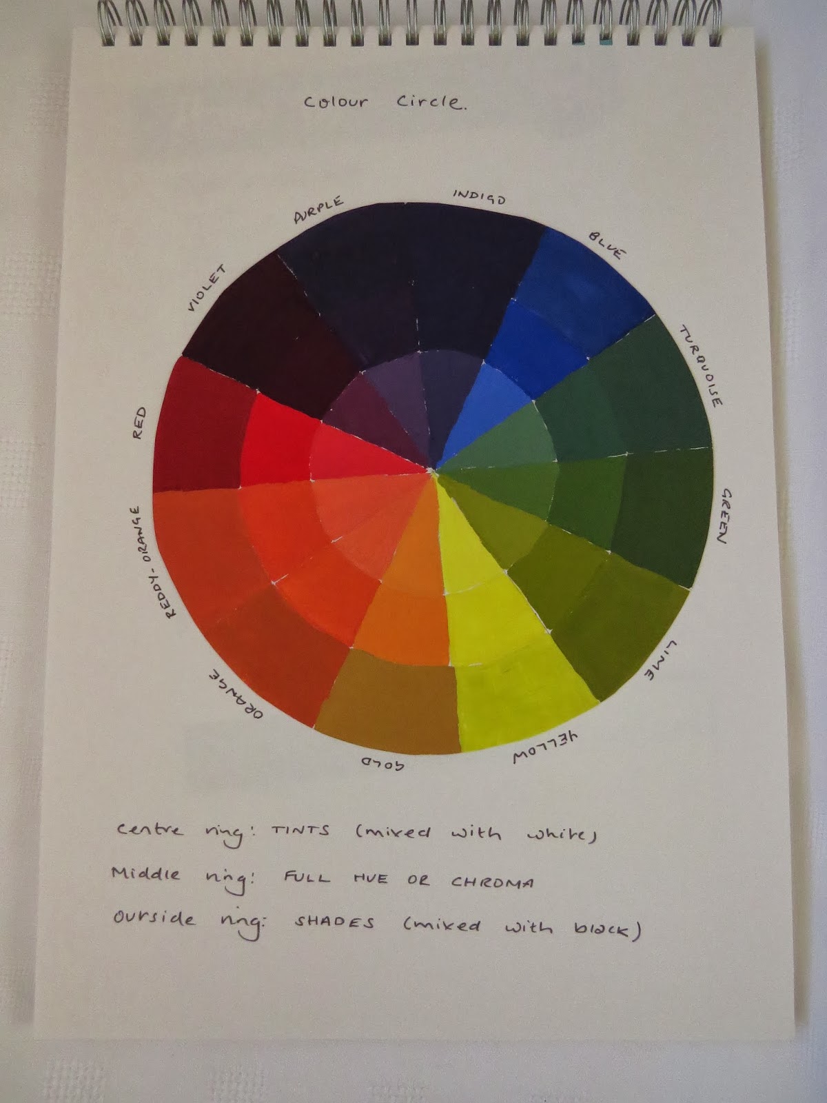
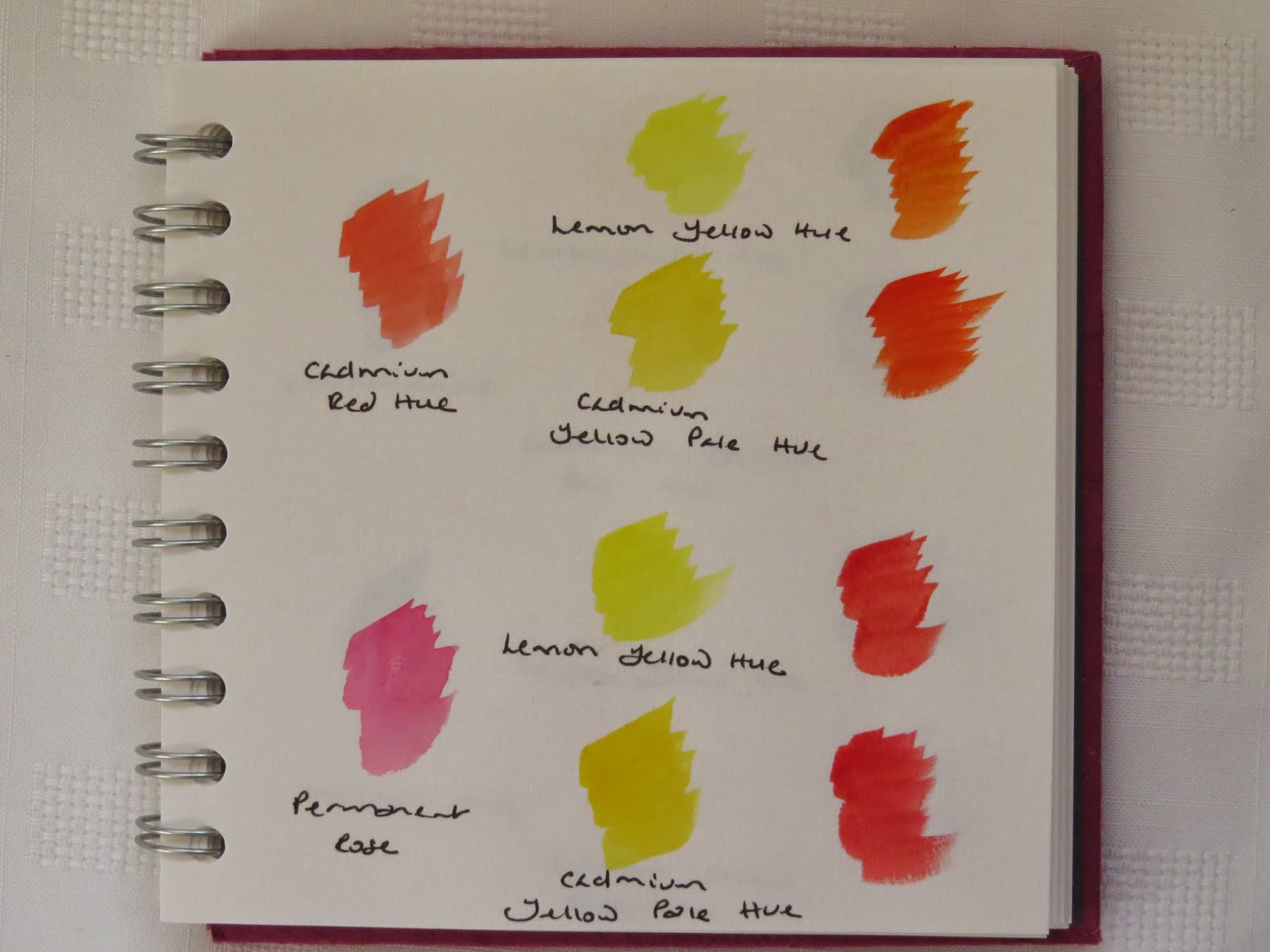
Obtaining a collection of papers and colouring them with brusho dyes was an exciting exercise. I chose to use the complementary colours  blue/orange, as I already had a collection of various fabrics and threads in this colour scheme, from a previous project that I had work on, in an embroidery group I belonged to.

I used cartridge, tissue, old newspapers, magazines,wallpaper lining, paper tableclothes and packing paper, plus various handmade and embossed papers.


I loved seeing the effects of the dyes on the different papers, especially on the pre-printed tissue paper. By adding differnt shades of the same colour, much more interest and texture was created on the paper. It is definetly an exercise I will repeat. However, my favourite sheets was created by accident. It was a sheet from a TV guide produced for a newspaper. The paper is matt and was used to soak up exccess dye during the exercise. The random patterns created from both the blue and orange dyes looked great over the printed pages. I think that the cartridge and lining paper will be used in the main for the design work in the next few chapters as they are stronger and easier to cut into interesting shapes.


Printing onto Coloured Paper.

Taking a shape of interest from a star on a mood board in chapter 1, I created two stamps from a rubber block. These simple printing blocks were made using the same source, but I changed the size, to help create different patterns.


I followed the suggested patterns given, but didn't find them that easy to create. As the block wasn't transparent, it made it hard to see when the actual print would be made. I wasn't inspired by the patterns being created and didn't feel that I would personally use this technique in my own work.


Inspired by the work of Hiliary Beattie, I decided to make to some stamps using mount board and foam. The same design source was used, but these would print more easily over a large area, and enable repeat patterns to be produced quickly. I thought that this would be more exciting when printing onto fabric.


I really liked the effect these printing blocks gave and how quickly the pattern was created. The patterns were printed onto paper first and then sprayed with ink. This had the effect of masking the colour of the printing, which then led me to over print the initial work (see samples b, c and d). My favourite sample was c, where both of the stamps were used showing different patterns using two sizes. This printing is something I would like to develop. I have now discovered that you can buy self adhesive foam, which will make it easier to create the blocks. I covered my foam with double-side tape, which left a sticky surface where there wasn't any foam . I painted the whole stamp with dilute PVA glue to seal it, but this didn't last when I wanted to clean the blocks to use again. I'm told emulsion paint also works.

(a)

(b)

(c)

Sheet (d) was created using a piece of packaging as a stamp, I like how you could over stamp but still see the paper behind. This effect would be good on a special or fussy background, wher you didn't want to loose its effect. At a later stage I will try this on the papers coloured with both the blue and orange brusho dyes.

(d)


Star Shapes from Coloured Paper.

This exercise created lots of interesting and pleasing results. It was easier to use scissors or a craft knife to cut the stars out, but it made me think that there are other possibilities. The patterns that could be made are endless, but I like the shapes being produced when I started to overlay stars and lay them other than in a central postion.This is a new idea to me and something I'm looking forward to exploring more when looking at more design shapes in both paper and fabric.


Sunday 19 January 2014

Module 1. "Stars and Crosses:" Chapter 1

The first task on Module 1, was to decided on which subject to research, stars or crosses. When looking at the definitions of each shape,  my initial thoughts were to explore crosses further. However, with my love of gardening and the winter looming, I decided to base this module on star shaped images, so that I could include flowers and snowflakes.


My collection of images were sourced from the internet, magazines, books, cards and personal photographs.

The line drawing of various star shapes were drawn, this proved to be more of a challenge than I had expected. Free hand sketches or mathematically correct shapes? I am the sort of person who likes things to be precise and this often prevents me from starting a project. I tried to remember my geometry skills from school to draw images accurately at first, but then plucked up the courage to just draw some images free hand, as the exercise was taking a long time.


Rubbings were made from printing stamps, cards and embossed card. They were made with basic wax crayons and a wash of brusho ink in a contrasting colour to show the patterns more clearly. This proved to be alot more difficult than I imagined and remembered from my childhood days. Surfaces were not always defined enough to produce a pattern that could be easily seen.


The Colour Wheel.

I had painted a colour wheel before, but not with gouache paints. I didn't find them that easy to work with at first and wondered if it would be better to dilute them slightly with water. When carrying out this task before, I just followed the formula to create the given colours. This time I was thinking more carefully about the different primary colours and the effects they produce, easpecially with the tints and shades. Up until a couple of years ago, I had just thought about mixing red and yellow to make orange etc. However, once I started to dye my own fabric, I realised that it was much more complicated, with warm and cold colours producing very different effects. This is an area that I would like to develop further, but I think that I will use water colours, rather than gouache paints. This work would then become an invaluable reference resource.


Melanie Testa recommended the watercolours used below to explore and gain experience when mixing these paints together. Although, this simple task gave me a glance into the possibilities of colour mixing, I can see that this is a whole area in its self. I would love to explore this more with both watercolours and acrylic paints, as I feel these are the mediums I prefer to work with. I would like to look at  colour mixing of both warm and cool colours against given pictures to gain a greater understanding of how colours are produced. I would also like to look at darkening colours, other than by adding black. Melanie, suggests usng a colours complement, as it both darkens and enlivens the colour.


Saturday 26 January 2013

City and Guild Certificate in Embroidery

About 6 years ago, I finally deicded that I would like to take a course in Embroidery to devlop my skills. I found a City & Guild course locally, went along to an exhibtion and was hooked. I picked up the enrolement form and couldn't wait to sign up. However, I had just been offered a part-time teaching post and needed to wait to find out which days they wanted me to cover. I was so disappointed when one of the days coincided with the course. Never mind I thought, it will probably be a different day next year. My days were still the same the following year, plus the college had decided to no longer offer the couse, due to the change in the syllabus. For several years I looked for a course to suit me that would be local, but with no luck. I then decided to find out more about Distant Learning courses as a friend had shown an interest and we felt that we could support each other. Finding a course that suited our needs and deciding on which level to study, wasn't easy, but finally last year in August, my friend and I signed up for the first module of C&G Level 3 in Embroidery, with Sian Martin of Distant Stitch.
Being a teacher (no longer working), I compiled a scheme of work to follow, with deadlines. I started with enthusiam, reading the whole student manual several times and researching the subject matter. A colour wheel was made using Gouache paints and different types of papers in various sizes were coloured with brusho dyes in the complementary colours of blue and orange. Although I kept on looking at the manual and deciding on what I wanted to do next, no work was produced for one reason or another. But, a new year and a new start and I have finally started work on the course. I have set aside one whole day plus an afternoon to work on the module. This blog will be a record of my work on this journey. Looking at other blogs of students following the course, the standard of work is high, the challenge will be to keep to the deadlines now set and to push my work to the next level.